


Colour

prof.dr. G.J.F. Smets and drs. J.J.P. Claessen
1. Introduction
In matters of design, much attention is devoted to the form of the product. Colour is often only thought of at a late stage in the process. As a result, colour is reduced to a 'superficial problem', a cosmetic layer. Considering the expressive power of colour, this is unjustified.
Let us look at a few of the functions of colour. Seeing in colour increases an organism's power of discernment. Suppose that an unripe fruit has the same shape and shade as a ripe fruit. In that case, without colour vision you will not see any difference and you will have a 50 % chance of tasting a sour fruit. Therefore, with colour vision you can see more (see the BBC "Horizon" video 'Colourful Notions', Ross & Massey, 1984).
For example, yachtsmen use the colour of the water (among other things) to estimate the force and direction of the wind. Surgeons are another example, when they operate using an endoscope. They get their bearings from small differences in colour.
In the animal kingdom, colour plays an important role in communication. Colour carries meaning: the red rumps of female monkeys (Hamadryas Baboons) attract the males. During the mating season, this red coloration becomes more intense. In contrast to low-ranking males, the dominant males have a brown rump. The Œlower' males adopt a red rump in order to show submission to the dominant male (Wickler, 1968). See Box 1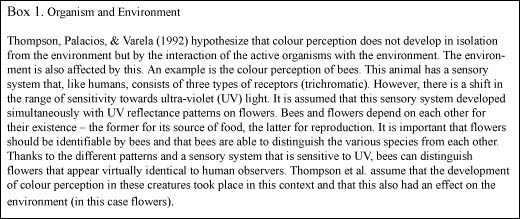
Designers make products for people in an environment in which they perceive and act. By understanding how people act, you are able to design products in such a way that people see what can be done with them and use them in a way that is obvious from looking at the product (Smets & Overbeeke, 1994).
In the study of form perception, one examines how people perceive products, how they see them and how they relate to them. Form perception is also connected with the colour of a product.
1.1 Basic Premises
There are four principles that serve as basic premises in the study of form perception (Smets, 1986). These principles will be referred to at various points in the text. To cite them in advance:
1. The world as we see it differs from the world that can be measured in physical terms.
2. The environment can be adapted to the perceptive capacities of the observer.
3. Words are inadequate to describe images, and
4. Study of the language of imagery leads to new applications.
The text will make clear what these principles signify.
1.2 Overview
A number of different aspects of colour perception will be discussed in more detail. The discussion will encompass the following subjects: colour, physiology, differences between colours, colour arrangement and rules of harmony, colour constancy, design applications based on a theory of colour, interaction between colour and 2-dimensional form, and research into colour and 3-dimensional form.
2. What is colour?
2.1 A Definition
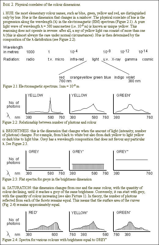
In the literature (Agoston, 1979; Wyszecki, 1986; Crozier, 1994) one can find various definitions of colour that have the following core in common: a visual experience in which three dimensions are distinguished. These are:
- hue (e.g. the colours of the rainbow, the colour circle or colour names)
- brightness (the light/dark dimension) and
- saturation (colour intensity - the greyishness of a colour). See Picture 1 for the experience and Box 2 for the explanation. When the question is considered in broader terms, one can add properties such as shine, transparency and fluorescence (Beck, 1972).
2.2 Form of Manifestation & Context
One and the same light composition may be perceived in different ways, depending on the form in which a colour manifests itself. (Thompson, Varela & Rosch, 1991). Two important forms of manifestation are illumination colour (see Picture 2), i.e. a colour that is reflected by a surface or object, and radiation colour (see Picture 3), a colour emanating from an (artificial) light source (Wyszecki, 1986). At least three conditions must be met in order to be able to perceive surface and object colours. One must have light (emanating from the sun or from an artificial light source), a surface that absorbs part of the emitted light and reflects the rest, and an observer who is sensitive to light. Box 3 contains a brief explanation of the light-sensitive cells in the eye.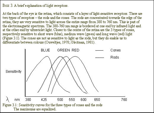
Apart from the form of manifestation, it makes a difference whether a colour is presented on its own or in combination with other colours. An example of this is simultaneous contrast: the logo in Picture 4 does not appear to be equally grey in all parts because the various parts are presented against light or dark backgrounds. In this case, the identical grey areas appear to be either darker or lighter.
Simultaneous contrast also applies to chromatic colours as in Picture 5. (Black, white and shades of grey are called achromatic colours; all other colours are chromatic). The greatest contrast is created when a colour is presented against its complementary colour. Two colours are complementary when they produce grey when mixed. A colour's after-image (see Picture 6: successive contrast) is always a complementary colour. As a result, after-images can be 'extinguished' if they appear against a complementary colour. A practical example here is formed by the green sheets and clothing in operating theatres. These allow surgeons to distinguish the red area of a wound more clearly because after-images merge with the surrounding area (Smets, 1986). A less familiar phenomenon, but no less significant, is assimilation (Picture 7), demonstrated again here using a TU Delft logo. As an example, De Weert (1994) depicts a wall under construction consisting of identical coloured bricks, half of which have already been pointed. The colour of the dark pointing 'spreads' over the bricks, which are also perceived as being darker as a result (Picture 8). The nature of the simultaneous contrast would lead one to expect the opposite result.
Manifestation form and context aside, humans can perceive about 10 million nuances of colour (Judd, in Agoston, 1979). The number of pigments and paints runs into thousands. The numerous colours available are categorized in a systematic fashion for artistic, educational, commercial and industrial purposes.
3. Colour Categorization
Just try to explain to someone, in words alone, which colours are to be found in your living room. You will probably have difficulty translating the colours that you see into language. This alone is sufficient reason to categorize colours in a systematic fashion.
In 1672, Newton discovered that white light, on passing through a prism, is split into the coloured lights of the spectrum - Red, Orange, Yellow, Green, Blue, Indigo and Violet (see Picture 9). (An easy way to remember this sequence is 'Richard Of York Gave Battle In Vain'). Conversely, these coloured lights can be combined again into white light. To achieve this, they must pass through a prism again. When light is mixed, it is known as additive mixing (see Picture 10). When paints, inks etc. are mixed, it is known as subtractive mixing (see Pictures 2 and 3 again).
Subsequently, artists discovered in the 18th and 19th centuries that primary colours could be mixed to produce secondary colours (blue + yellow = green, red + blue = purple, yellow + red = orange). In combination with perception of the complementary colours, this laid the basis for the development of colour circles (see Picture 11) by Goethe, Runge, Delacroix and Turner, among others. In these, secondary colours lie between their 'parent' colours and complementary colours are opposite each other.
It was already realized at that time that we can distinguish three dimensions in a colour. This led to the creation of colour categorization systems, whereby the three dimensions of colour are arranged in 3 directions. For an overview of these systems, see Agoston's book (1979). A problem with colour categorization is the choice of unit in which to express the differences between various colours. For example, it would appear an obvious solution to take the quantity of coloured pigment. However, this is not really useful. If one puts twice as much red pigment into a solvent, it does not mean that the solution will appear twice as red. This is where we encounter the first principle concerning the difference between the perceived world and the physically measurable world.
Colour categorization systems serve primarily to aid communication about colour. Some of these systems are based on the accidental availability of colours (such as RAL), marketing data (colour selections of paint manufacturers) or pigment composition (for an overview, see Nemcsics, 1993). Now, a system that relates to our perception is being discussed. The unit to express the differences between colours is a perceptual unit.
3.1 The Munsell Colour System
Albert Munsell (1858 1918) was extremely aware that language is an unsuitable means of expressing colour nuances. This is simply because everyone understands something slightly different by a term such as 'tomato red' (Munsell, 1981). This is an example of the third principle, that language is inadequate to describe an image. Around 1900, while preparing to teach about colour, Munsell had the idea of categorizing colours according to hue, brightness and saturation. He referred to these dimensions as hue, lightness and chroma (Picture 12). An atlas was created, consisting of coloured cards, with each card allocated a code referring to the dimensional values. In Munsell's words, "Colour anarchy is replaced by systematic colour description" (Munsell, p. 24). Later, a 3-dimensional tree was developed in which the colours were allocated their places (again, see Picture 12). The colour circle is the basis for this tree. Through the centre of the circle runs a vertical axis along which the shades of grey are arranged, with black and white at the extremes. On the circle's periphery, the most saturated colours lie furthest from the central axis. Depending on how much pigment (or filtering) is available, they will lie closer to or further from the central axis. Depending on their brightness (imagine, for example, the difference between yellow and violet) they will lie lower or higher on the circumference. Along the radii towards the centre, the colours are arranged in declining order of saturation until they touch the grey axis.
The Munsell Colour Atlas now consists of 1,325 matt and 1,600 gloss samples (1976 version). A page from an atlas of this type, comparable with the view in the detail from the Colour Solid, is shown in Picture 13.
3.2 Jnd's: just noticeable differences
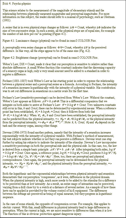
The Munsell system is more than just a categorization. Its other primary purpose was to teach students to make visual estimates of colours and colour differences. The differences between the colours are therefore based on a perceptual scale: the just noticeable difference (jnd). Suppose you hold, in each hand, a 100g weight. Small weights of 1g are now gradually added to your left hand until you say that you can perceive a difference between the two weights on the left and the right. If, for example, you can notice it after 2g have been added, then this difference is one jnd. If you divide this difference by the standard (100g), you obtain a constant of 0.02: the Weber fraction. If weights of 500g are now laid on your hands, you will only notice a difference when one increases to 510g rather than at 502g. Weber (1795-1878) formulated this relationship into a law: DI/s = const, whereby DI is the just noticeable difference between two sources of stimulation (in this case, weight), z is a standard and const is the Weber fraction. Let us return for a moment to the vertical axis of the Munsell tree, which shows the dimension of brightness. On this, the just noticeable difference between two colour samples is measured. This difference is used as the basic unit of variation on the scale of brightness from black to white. The same applies to differences of hue and saturation. In this way, Munsell adapted his system to the perceptive capacities of the users (the 2nd principle). A Munsell system will therefore be able to contain a greater number of facets in smaller steps for a sensitive/trained user. See Box 4.
3.3 Harmony
According to Munsell, the organization of the colour tree lends itself excellently to the making of harmonious combinations. He speaks of 3 types of path that suggest combinations that are 'pleasing' to the eye: vertically along the brightness axis, horizontal and sideways along the 'neighbouring' colours, and a horizontal path through the neutral centre to a complementary colour. These 3 types of colour combination are in ascending order of 'daring' and make more demands of the user's sense of colour. Furthermore, it is possible to make combinations of these three paths, whereby you move around the outside of the colour tree to (for example) brighter, less saturated and complementary colours. After lengthy practice, the user will get to know the system's arrangement better. The colour tree will then no longer be needed in order to find harmonious or even 'dissonant' colours.
3.4 Munsell's System Applied
Finally, let us look at an example of how the Munsell system may be applied. At the Form Theory department of the TU Delft, a Munsell tree has been developed in the MOVE CAD package for use in virtual reality systems. In this, selections are made by 'roaming' with your hand through the 3D Munsell tree. This allows the designer to evaluate a colour selection immediately on a three-dimensional model in an environment. In the current software for colour manipulation, you mainly find 'buttons' and 'slide bars' for selecting colours and it is hardly possible to make a direct colour selection as you can in MOVE. The CAD package, which was then still experimental, is regrettably no longer available.
Applications can, in turn, also contribute to the formation of theories. In the next part we shall examine an example of this.
4. Instant Cameras and Colour
In 1947, Edwin Land developed an instant camera - the Polaroid (Pearce, 1991). In his search for a new colour film that could consist of fewer layers than existing types, he had an idea for a theory of colour perception, the retinex theory (Land, 1977).
4.1 Two-Colour Film
In 1959, land carried out the following experiment. He took two monochrome slides of a colourful still life, one through a green filter and the other through a red filter. He then projected the two slides onto each other, with the slide that had been created using a red filter also being projected through a red filter. The slide that was created with the green filter was projected with no filter (see Picture 14.0-3).
What you would expect was a projection in which red and pink colours would predominate, in addition to black and white. However, Land discovered that the still life was nearly as rich in colour as the original. This convinced him that the energy that stimulates our eye does not necessarily determine our perception. This has a connection with a practical problem that one experiences when making photographs but not as an observer. If you take a picture indoors by the light of a normal bulb and using a slow film (made for daylight conditions), your photograph will have a red tinge. As a direct observer, you are not affected by this phenomenon. When you go outside the house or, conversely, go indoors from outside, the colour of your clothes will remain pretty much the same. This stability of our colour perception under changing lighting conditions is called colour constancy (this is explained in onnoS COLOUR Shop in the BBC "Horizon" video 'Colourful Notions').
4.2 Retinex Theory
If energy levels continually change and our perception is constant, what is its determining factor? Land hypothesizes, based on the premise of 3 types of receptor, that there are 3 retinex systems. A retinex system is a functional description of a process that takes place both in the receptors and in the visual centre of the brain. Land chose the term retinex theory, a contraction of retina en cortex.
In each system, the relative intensity of the light determines the colour that you perceive. Land calls this 'lightness', a measurement that is associated with the organism. Suppose that you look at Land's still life, consisting of various types of fruit, through a filter. If you look through a red filter, the tomatoes appear very light, the green apples look dark and a blue bowl looks darkest of all. You see things the other way round if you look through a blue filter. And if you look through a green filter, the green apple appears lightest. The table provides an overview.
Using the filters, you cancel out the effect of the light source, because only those wavelengths not absorbed by the filter pass through. Land selected these filters in such a way that they approximate the sensitivity of the three receptors in the eye. A colour can now be specified by three values, each of which separately indicates the relative intensity in a retinex system. In order to define the relative intensities, Land developed an algorithm. In this, contrasts (relationships between physical light intensities of two surfaces) between all the coloured surfaces in a visual scene are determined for each retinex system. With respect to this, see also Box 5.
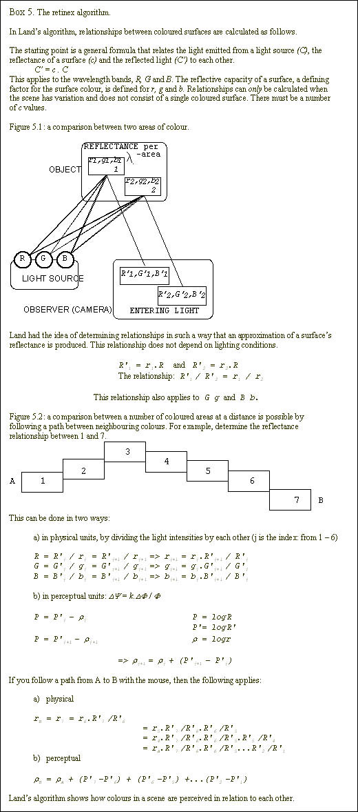
For the purposes of his research, Land built a light meter into a 'mouse' in order to find the contrast values. He did this by moving the mouse over a number of small areas with different colours. The measurement he arrived at in this way is a relationship of intensities that is independent of the lighting conditions. The movement of the mouse in this algorithm forms a nice parallel with Gibson's ecological perception theory (1979), in which an organism's movement is important for perception. Land hypothesizes that the 'mouse-on-path' algorithm is achieved in an organism by means of eye movements. This is probably supplemented by movements of the head and body. By means of these, standpoints in relation to light sources are continuously changed, and these could stimulate the determination of relative intensities.
4.3 An Application: Robotic Vision
Land's retinex theory has had a great influence on research into colour perception. With the retinex algorithm, Land made a contribution to the development of colour-constant perception by robotic vision systems. A recent application of Land's theory is the automated inspection of fish.
At TNO-TPD, a system has been developed that can detect two kinds of marks in fish (Van Munster, 1994). Consumers have a variety of negative opinions regarding these two marks, making it important to be able to distinguish them. There are blue marks (caused by the abdominal membrane) and red marks (caused by veins). Inspection under green light does not show any difference, because the relative intensity of the blue and red marks is equal. The task can be carried out under a combination of infrared and blue light. Under infrared light, only the red mark shows up as light coloured and under blue illumination only the blue mark. By carrying out the inspection within a single wavelength range, the robot can distinguish the different colours.
To conclude, a final comment on colour constancy. This phenomenon shows how different the perceptual world and the physical world are (the 1st principle). Land's theory provides an explanation that has led to new applications. The interaction between practical problems and theory formation shows that research and design complement each other.
A final practical problem that must be dealt with is the question of whether 3D forms are perceived differently depending on the colour. Much is known about the effects of colour on an observed 2D form, but the question is: can these effects be extrapolated to our 3D world
5. Colour-Form Interaction
In traditional research into colour perception, a strict distinction is made between colour and form. The perception of form is based on colour contrasts, so form and colour are certainly not independent of each other.
The research that has been carried out into the interaction between colour and form has mainly been based on flat colour samples. This has demonstrated that colour can influence an observed form (Whitfield & Wiltshire, 1990). For example, the effects of colour (or one of its dimensions) have been demonstrated on the perceived characteristics of forms, such as size, depth, weight and temperature.
For designers, it is important to know how differently coloured forms are perceived. If the characteristics of forms, or even the general form, can be more or less accentuated by means of coloration, this can have significance for the expression of a form's handling possibilities (for example, the degree to which a handle for picking something up is pronounced).
5.1 Interaction
Information about the effects of colour can be found both in art literature and in scientific journals on perception studies. Kandinsky (1956, in Arnheim; 1991, in Varela, Thompson & Rosch) contends that the colour yellow has an expanding effect on an observed form and that blue has a contracting effect. In the study by Thompson and Stone (1993) into chromostereopsis*, they found that yellow is perceived as being closer than blue.
*Chromostereopsis is the phenomenon whereby two differently coloured, identical forms that are viewed at equal distance from the observer are perceived to be at different distances. This applies in particular to the combination of red and blue, with red being perceived as being closer. This effect also occurs with other combinations, such as yellow and blue. There are differences between individuals; some observers perceive blue as being closer than red.
This expanding effect of yellow and the difference in perceived distance are results of research into 2D material (see Picture 15). So how does this effect the relationship between form and colour in 3D forms? To test this, a 3D form with a number of characteristics was used: a sharp edge, a hollow and a bulging part. What is the effect of the colours yellow and blue on these characteristics and on the form as a whole.
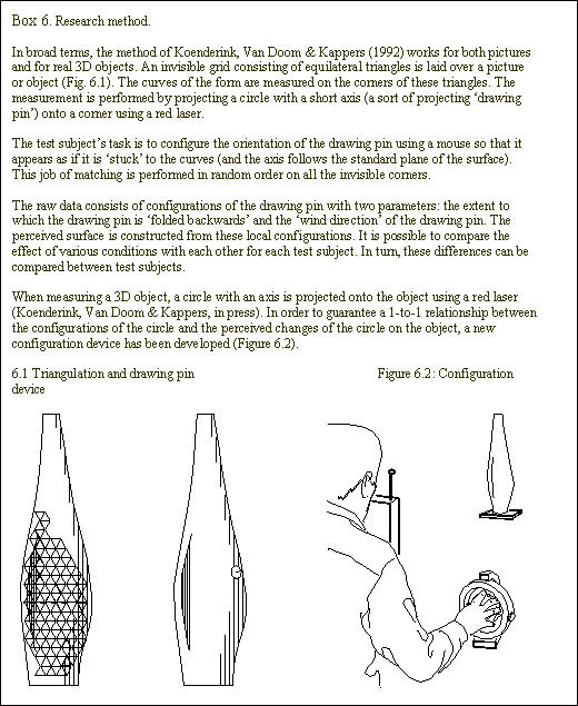
One problem here is that of establishing what an observer experiences when looking at a 3D form. How do you define what someone is seeing? Koenderink, Van Doorn and Kappers (1992) have developed a method that allows the measurement of perceived rounded areas in a picture of a spatial object or of a real 3D object.
5.2 Results
It is apparent from the research into 3D forms that from 7 to 9 test subjects perceive the 'belly' section of the blue form as being more rounded than the belly of the yellow form. The other two saw the yellow Œbelly' as being more rounded. In addition, the sharp edge of the yellow form appears to project more (8 out of 9 test subjects). Compare the two wire grids in Picture 16. Object & reconstructions
It is apparent that statements concerning 2D material do not necessarily apply to 3D material. After all, the research shows that blue expands, not yellow. Research is currently being carried out into the possible causes of this effect.
5.3 Applications
A method such as Koenderink's is useful for studying differences between the perceptual world and the physical world (1st principle). With this, no words are needed to describe the perceived form (3rd principle) and the test subject's task is as simple as measuring length with a measuring tape. The data can be used in the modification of the environment to our perceptive capacities (2nd principle). For example, the perceived 'spaciousness' of trunks can be measured using this method (a concrete question from a well-known manufacturer), or the perceived differences between the Œrendered' colour images in CAD systems, 3D models or dummies can be mapped. Despite the enormous possibilities for 3D reproduction in CAD, the perceived form can differ quite a lot from a real, spatial model in colour.
In Conclusion
In both design and perception research, attention is mainly devoted to form. It may be that this is because colour is so difficult to grasp. As Kemp says (1990, page 261), "Even our shifting perceptions and representations of space seem positively stable and consistent when compared to the elusiveness of colour vision". That does not detract from the fact that colour is important to our perception. It is precisely the continual observation of colour differences that enables an observer to act within the environment. For researchers, it is interesting to define the relationship between colour and possibilities for action; for designers, it is interesting to use colour to create these possibilities.
REFERENCES
Agoston, G.A. (1979). Color theory and its application in art and design. Berlin: Springer-Verlag.
Crozier, R. (1994). Manufactured pleasures: Psychological responses to design. Manchester: Manchester University Press.
Beck, J. (1972). Surface Color Perception. Ithaca: Cornell University Press.
Gibson, J.J. (1979). The ecological approach to visual perception. Boston: Houghton Mifflin Company.
Gleitman, H. (1981). Psychology. New York: Norton.
Goethe (p. 331) in Arnheim, R. (1956). Art and visual perception. London: Faber and Faber.
Goethe, J.W. (1971). Goethes Farbenlehre. (R. Matthaei, editor). Ravensburg, Otto Maier Verlag. (Original work published 1810).
Kandinsky (p. 327) in: Arnheim, R. (1956). Art and visual perception. London: Faber and Faber.
Kandinsky (p. 162) in: Varela, F.J., Thompson, E., & Rosch, E. (1991). The embodied mind. Massachusetts: MIT Press.
Kemp, M. (1990). The science of art. Yale University Press, New Haven.
Koenderink, J.J., Van Doorn, A.J., & Kappers, A.M.L. (1992). Surface perception in pictures. Perception & Psychophysics, 52 (5), 487-496.
Koenderink, J.J., Van Doorn, A.J., & Kappers, A.M.L. (in press). Depth relief. Perception & Psychophysics.
Land, E.H. (1977) The retinex theory of color vision. Scientific American, 239, 108-128.
Munsell, A.H. (1981). A color notation. (14th edition) Baltimore, Maryland: Munsell Color Company, Inc.
Munster van, R.J. (1994). Machine vision, hoe pak ik het aan? Lezing ter ere van bijeenkomst 'Vision', TNO Produktcentrum.
Nemcsics, A. (1993). Colour Dynamics: Environmental colour design. Budapest: Akadémiai Kiadó.
Ouweltjes, J.L. (1978). Het zien van kleuren. Deventer: Kluwer Technische Boeken B.V.
Pearce, C. (1991). Twentieth century design classics. London: H.C. Blossom Ltd.
Ross, J. (Producer), & Massey, G. (Editor). (1984). Colourful notions [Videotape]. London: BBC.
Smets, G.J.F. (1986). Vormleer: de paradox van de vorm. Amsterdam: Bert Bakker.
Smets, G.J.F. (1994). Industrial design engineering and the theory of direct perception. Design Studies, 15 (2), 175-184.
Thompson, E., Palacios, A., & Varela, F.J. (1992). Ways of coloring: Comparative color vision as a case study for cognitive science. Behavioral and Brain Sciences, 15, 1-74.
Thompson, P., & Stone, R. (1993). Chromostereopsis: The relative contributions of colour and luminance to perceived depth. Proceedings of the Sixteenth European Conference on Visual Perception Edinburgh, UK, 25-29 August 1993. Perception, 22 supplement, 9-10.
Varela, F.J., Thompson, E., & Rosch, E. (1991). The embodied mind. Massachusetts: MIT Press.
Weert de, Ch.M.M. (1994). Perceptie & Psychofysica. Intreerede NICI, K.U. Nijmegen.
Wickler, W. (1968). Mimicry in plants and animals. Verona: Officine Grafiche Arnoldo Mondadori.
Whitfield, T.W.A., & Wiltshire, T.J. (1990). Color psychology: A critical review. Genetic, Social, and General Psychology Monographs, 116, 387-411.
Wyszecki, G. (1986) Color appearance. In K.R. Boff, L. Kaufman, & J.P. Thomas (Eds.), Handbook of perception and human performance: Vol. I. Sensory processes and perception Chapter 9 (pp. 1-57). New York: Wiley & Sons, Inc.
contact
Onno van Nierop
Landbergstraat 15
2628CE Delft
room: 10-2A-19
phone: +31(0)15 27 83064
email: o.a.vannierop@io.tudelft.nl
Link to personal page:
Onno van NieropLinks to related topics:
designID-Studiolab
our research
People who inspired me
Peter StruyckenElsworth Kelly
Johannes Itten
Isaac Israëls
Henri Matisse