


OnnoS COLOUR Pics
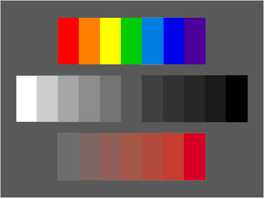
Pict 1 Definition
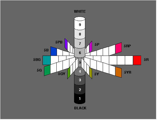
Here you can experience the three dimensions of colour as they can be shown on a screen. At the top is a series of hues (chromatic), comparable to those in a rainbow. In the middle, you can see a series of greys in between white and black (achromatic) in declining order of brightness. And at the bottom you can see a series of varying saturation. In this, the brightness remains constant while the saturation increases from left to right.
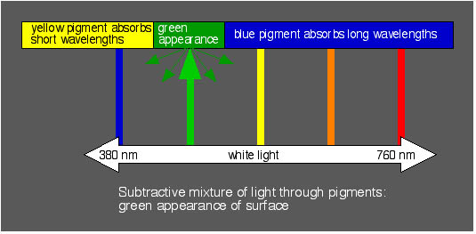
Pict 2 Illumination Colour
How is an illumination colour created? When there is light that is partly reflected and partly absorbed by a surface - in practice, this is frequently a pigment - and an observer that is sensitive to that light.
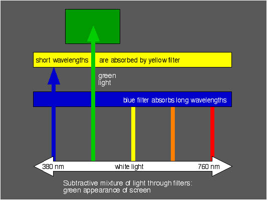
Pict 3 Radiation Colour
Light that passes through filters or originates from coloured light sources can be perceived, whether reflected from a surface or not, by an observer that is sensitive to that light.
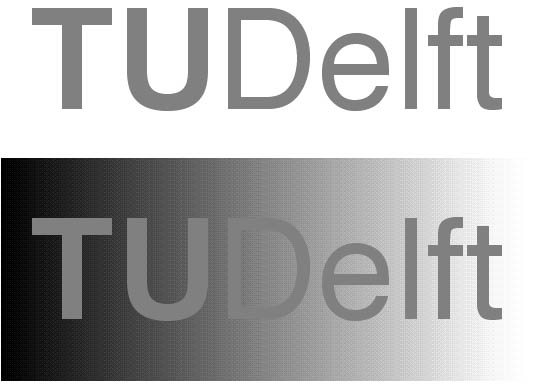
Pict 4 Achromatic Simultaneous Contrast
All the letters of a logo are the same shade of grey. When placed against a background that progresses from dark to light, the logo appears lighter against a dark section of the background, and dark against a lighter section.
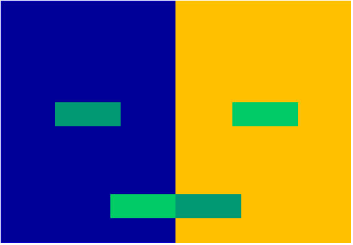
Pict 5 Chromatic Simultaneous Contrast
Two small areas of colour are placed in the centre of a background with a different colour. The three dimensions of these small areas of colour are manipulated in such a way that they are perceived as being identical. The difference between these small areas can be perceived by looking at the copies of them that are placed at the bottom of the backgrounds with their relative positions switched.
Both examples of simultaneous contrast give an incisive demonstration of the effect of context in the visual domain. The importance can be measured by their relative magnitudes. Based on research into tactile / haptic form perception (Kappers & Van Doorn), among other things, it is hardly audacious to suppose that context effects play a similar role in the domain of the other senses.
Simultaneous contrast is also described as a foreground - background phenomenon. The designing of a context for perception can be interpreted as making use of the interaction between foreground and background within the various sensory domains. In addition to this sensory domain, we make use of the cognitive domain (what we know) and the motor domain (what we can do).
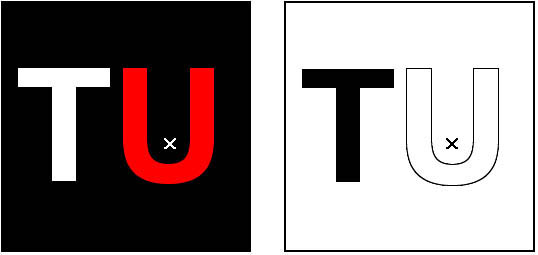
Pict 6 Successive Contrast
If you stare at the small cross in the red U of the left-hand logo for between ten and twenty seconds, and then transfer your gaze to the small cross in the right-hand logo, the U will once again take on the complementary blue corporate colour (cyan).

Pict 7 Achromatic Assimilation
A regularly repeated logo, partly in white and partly in black, is placed against a grey background. The field with the white logo is perceived as being lighter than the field with the black logo.
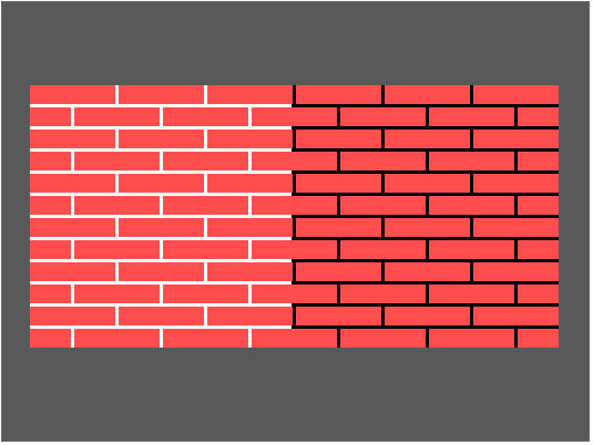
Pict 8 Chromatic Assimilation
A picture of a brick wall that is partially pointed. The pointed part looks lighter and the unpointed section of the wall looks darker.
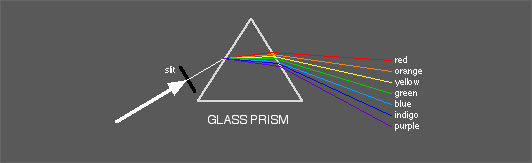
Pict 9 Spectrum
Creation of a spectrum using a glass prism.
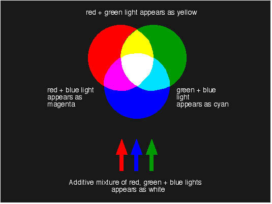
Pict 10 Additive Mixing
When red, green and blue light from a prism or some other source are mixed, this will produce the perception of white light. Mixing just two of these colours at a time produces colours that are respectively denoted as yellow, cyan and magenta.
Conversely, in this subtractive procedure a printer or colour photocopier uses pigments in the above colours in order to be able to give the sensation of red, green and blue.
NB: In 'onnoS COLOUR Shop' you can experiment with a RGB colour mixer.
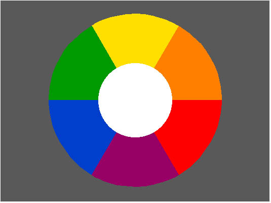
Pict 11 Colour Circle
A rather random colour circle.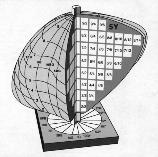
Pict 12 Munsell
At the top is the Munsell Colour Solid, in which the colours are arranged in order. The sectional view shows clearly how this is done. Underneath you can see the central, vertical series of greys with a single crown of 'branches' with areas of identical lightness - a good illustration of the saturation difference (chroma) between the various hues. In Picture 1 you can see a complete saturation series for a single hue and Picture 13 shows an example of a vertical sectional view.
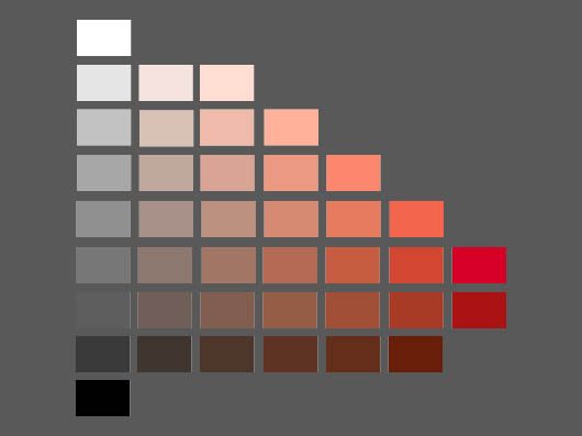
Pict 13 Munsell
This shows a page from the Munsell Colour Atlas (Student Version). As you can see, it is not that easy to correctly transfer all these colour progressions to a screen.
NB: In 'onnoS COLOUR Shop' you can examine a Munsell Colour Atlas.
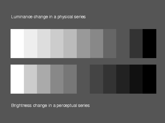
Box 4.1 and box 4.2
Here you can see the luminance progression in a physical series of greys in the upper box (4.1). In the lower box (4.2) you can see the lightness progression in a perceptual series of greys.
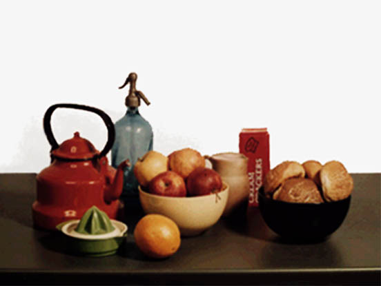
Pict 14.0 Land's photograph and projection of a still life
This shows (a new version of) the still life that is to be photographed.
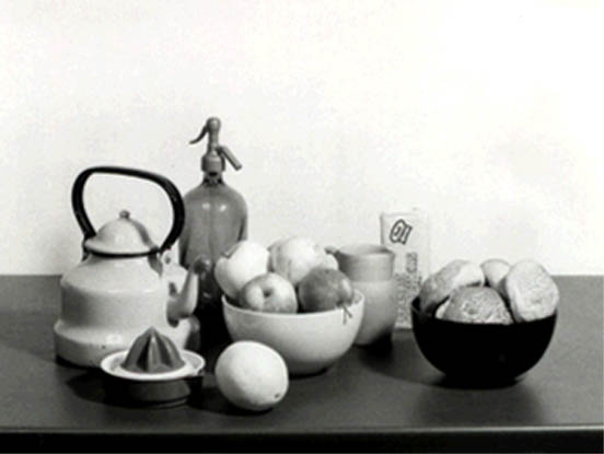
Pict 14.1 Land's photograph and projection of a still life
Here you can see the slide that was taken through a red filter.
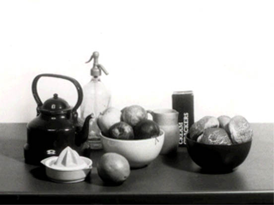
Pict 14.2 Land's photograph and projection of a still life
Here you can see the slide that was taken through a green filter.
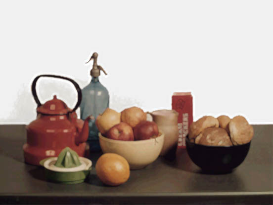
Pict 14.3 Land's photograph and projection of a still life
Here you can see the effect when the two slides are superimposed in a projection. The slide that was taken through a red filter is projected through a red filter. The slide that was taken through a green filter is projected using no filter.
NB: In 'onnoS COLOUR Intro' you can experience this projection demonstration for yourself.
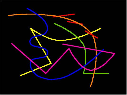
Pict 15 Chromostereopsis
You can experience this phenomenon here by means of simple, coloured lines. However, on the screen there seems to be a reversal or complementary effect: here, blue appears to be in front of yellow.
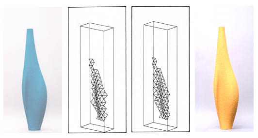
Pict 16 Relationship between Form and Colour
The two coloured objects with, in between them, the reconstructed results of the study. The blue shape appeared more rounded than the yellow one.
contact
Onno van Nierop
Landbergstraat 15
2628CE Delft
room: 10-2A-19
phone: +31(0)15 27 83064
email: o.a.vannierop@io.tudelft.nl
Link to personal page:
Onno van NieropLinks to related topics:
designID-Studiolab
our research
People who inspired me
Peter StruyckenElsworth Kelly
Johannes Itten
Isaac Israëls
Henri Matisse